Pinnacle International Hospitality
Services: UI/UX Design
Timeline: 3 months
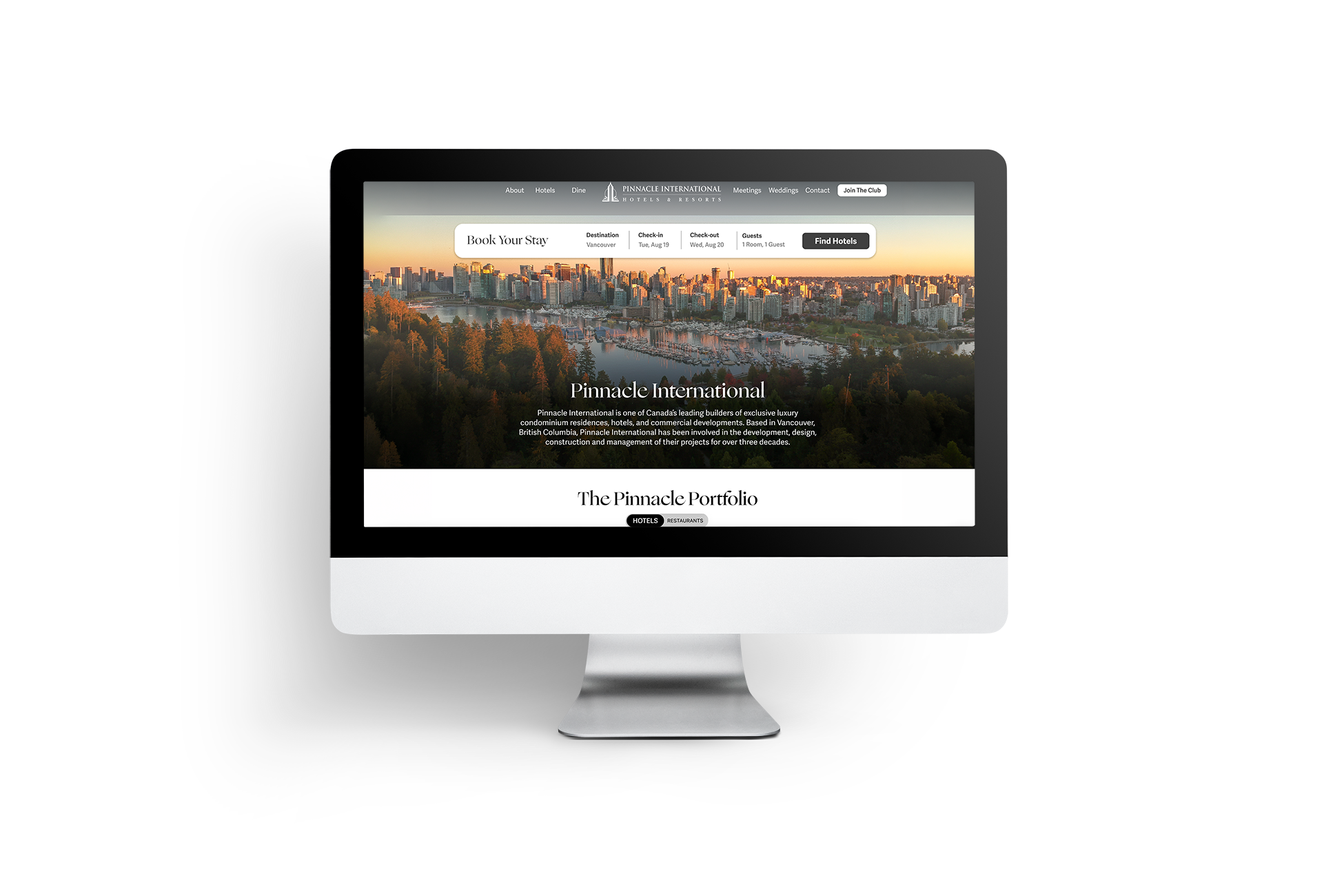
At a time of expansion for Pinnacle International Hospitality, I led the redesign of the corporate website that brings together all eight hotel and restaurant brands under one central brand hub. The goal of this project was not only to showcase the growing portfolio, but also to strengthen Pinnacle International as a recognizable brand and communicate its role as a leader in developing and hospitality in Canada.
The Problem
With three Le Méridien properties joining the portfolio, the number of brands featured on the website had nearly doubled compared to the previous version. The challenge was to present a much larger brand ecosystem in a way that still felt clean, intuitive, and easy to navigate. The previous site style was very image-based and felt boxy, which made it difficult to scale without feeling cluttered or overwhelming.
How might we create a unified, and intuitive central website for Pinnacle International that clearly communicates the brand while showcasing all eight hospitality brands in a clean way?
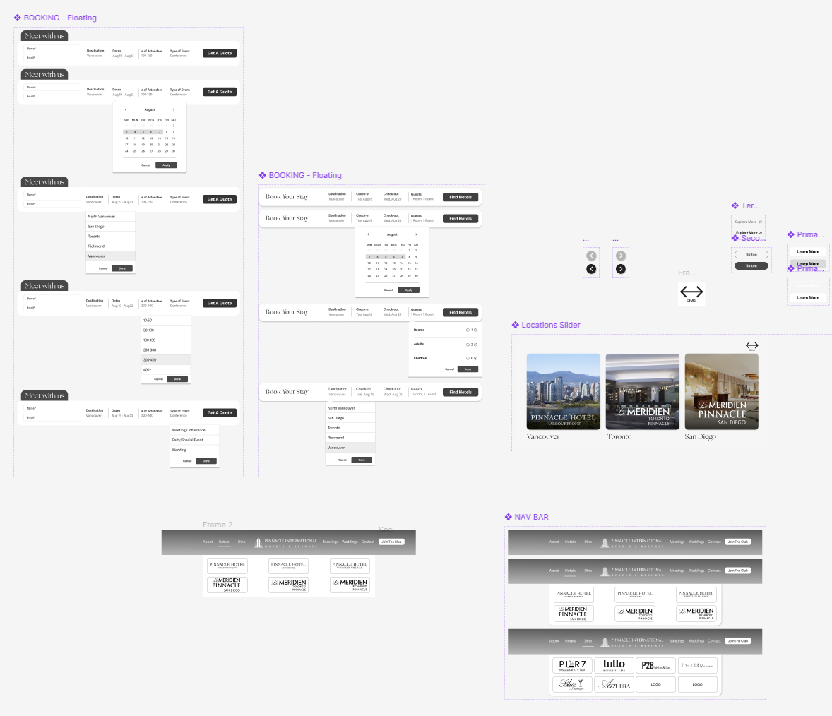
UI COMPONENTS
The Solution
I developed a minimalist and neutral visual direction that could work across all brands while keeping the focus on guiding users toward each individual hotel and restaurant website. I introduced a masonry style layout using elevated images, a cleaner navigation structure, and smoother interactions. Rounded corners, drag-to-scroll sections, and a more fluid layout helped create a softer and more modern browsing experience while improving the overall user flow.
Beyond the visual redesign, the main objective was strategic. Many guests were familiar with the individual hotels but unaware that they were part of a larger brand, that is also a leading developer in Canada. The new website clearly communicates Pinnacle International as the parent brand, and introduces the addition of the Le Méridien properties, including the upcoming Le Méridien Toronto located within the Pinnacle Skytower.